Design tips & trends
Five ways to work Pantone’s Classic Blue into your interiors
Rawson Homes’ interior design manager Julia Johnston tells us how to incorporate the global colour trend of 2020, Pantone’s Classic Blue, into our home styling.
Classic Blue is the hue of 2020, according to the Pantone Colour Institute, which means that if you haven’t already noticed this bold and brilliant shade popping up in fashion, textiles, and interiors, then you soon will.
Pantone’s experts combed the world looking for colour influences in art, media, lifestyle, films in production and popular travel destinations and arrived at this timeless shade, which they describe as “reminiscent of the sky at dusk”.
The company said Classic Blue or Pantone 19-4042 is a “solid and dependable hue we can always rely on” and creates “a sense of peace and tranquillity to the human spirit”.
The choice was a sharp departure from 2019’s vivacious Living Coral and 2018’s Ultraviolet, and is particularly well suited to interior design, according to Rawson Homes’ interior design manager Julia Johnston.
https://www.instagram.com/p/B_q5tGjlr3r/?utm_source=ig_web_copy_link
She says that the timelessness and versatility of Classic Blue means that you can work it into almost any room of the house.
The perfect accent colour
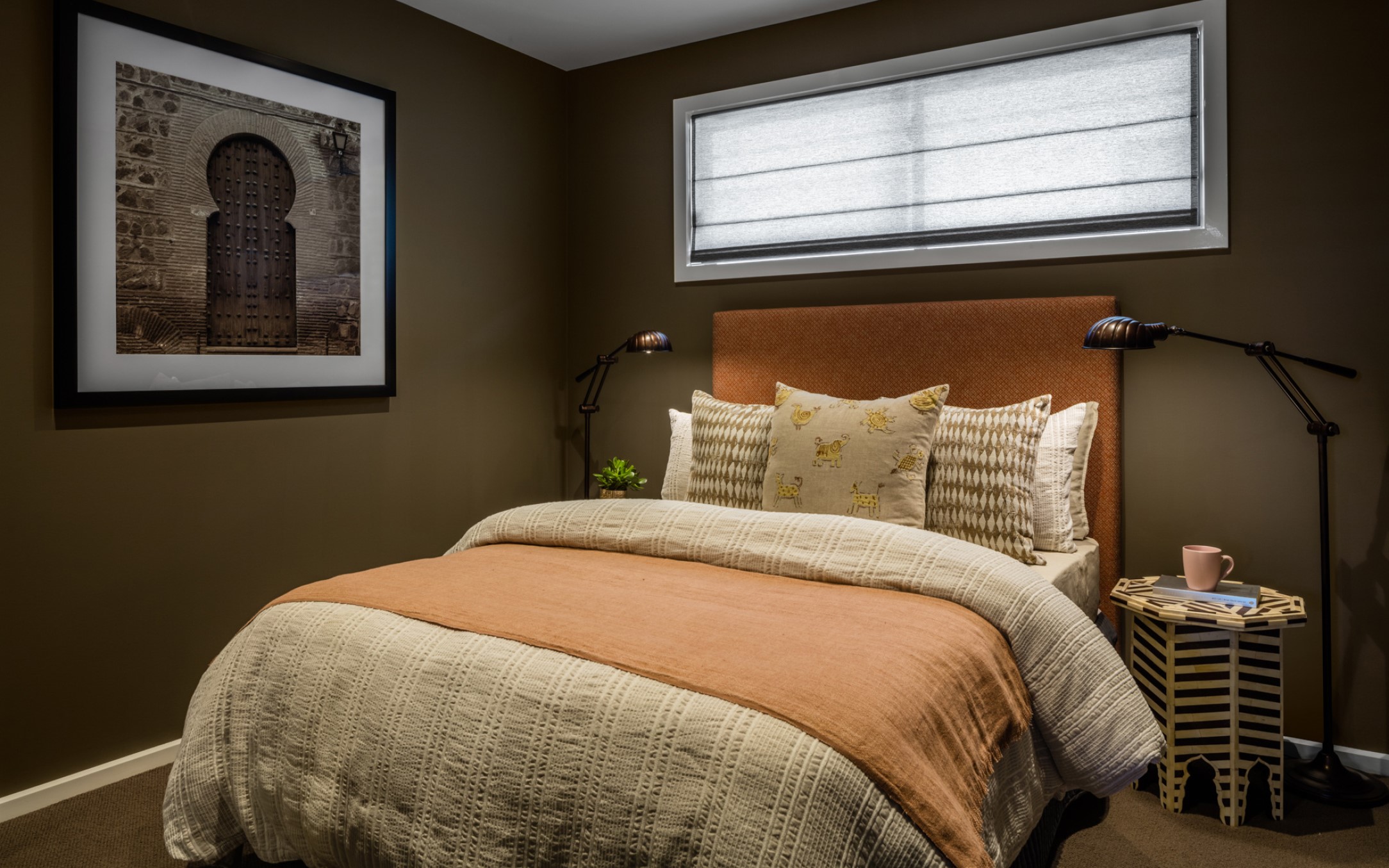
“We’ve seen a lot of blush and terracotta and olive green in interiors recently, and a stronger, richer colour such as Classic Blue works in really well with these earthy tones.”
https://www.instagram.com/p/BfzSa_-jEa6/?utm_source=ig_web_copy_link
“Our team also uses a lot of Classic Blue as an accent colour in our Hamptons-style interiors.
“It pops against all the white and neutral tones and creates a fresh coastal feel that doesn’t date, which is probably why it remains so popular among our customers.”
When it comes to incorporating colour trends into your home, Julia advises taking stock of the pieces you already have before getting too carried away.
“A lot of people fall in love with a trend and will spend a lot of money but find that when they get home, it doesn’t suit anything else in the room.”
“Some shades of Classic Blue are quite bright; others have a dirtiness and earthiness to them so it’s also about finding the right tone for your space.”
The best part about playing with colour is that you can go as bold (or subtle) as you like, so if painting an entire room to match your favourite pair of jeans sounds a bit daunting, check out Julia’s tips for simple ways you can embrace Classic Blue in your home decor.
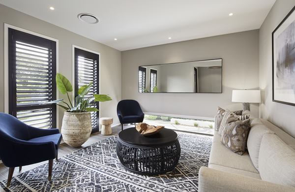
A dark sofa can be a bit imposing in a small space, but a smaller feature chair in a plush fabric such as velvet will achieve a similar look without dominating the room.
Cushions
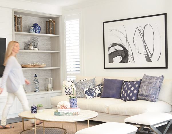
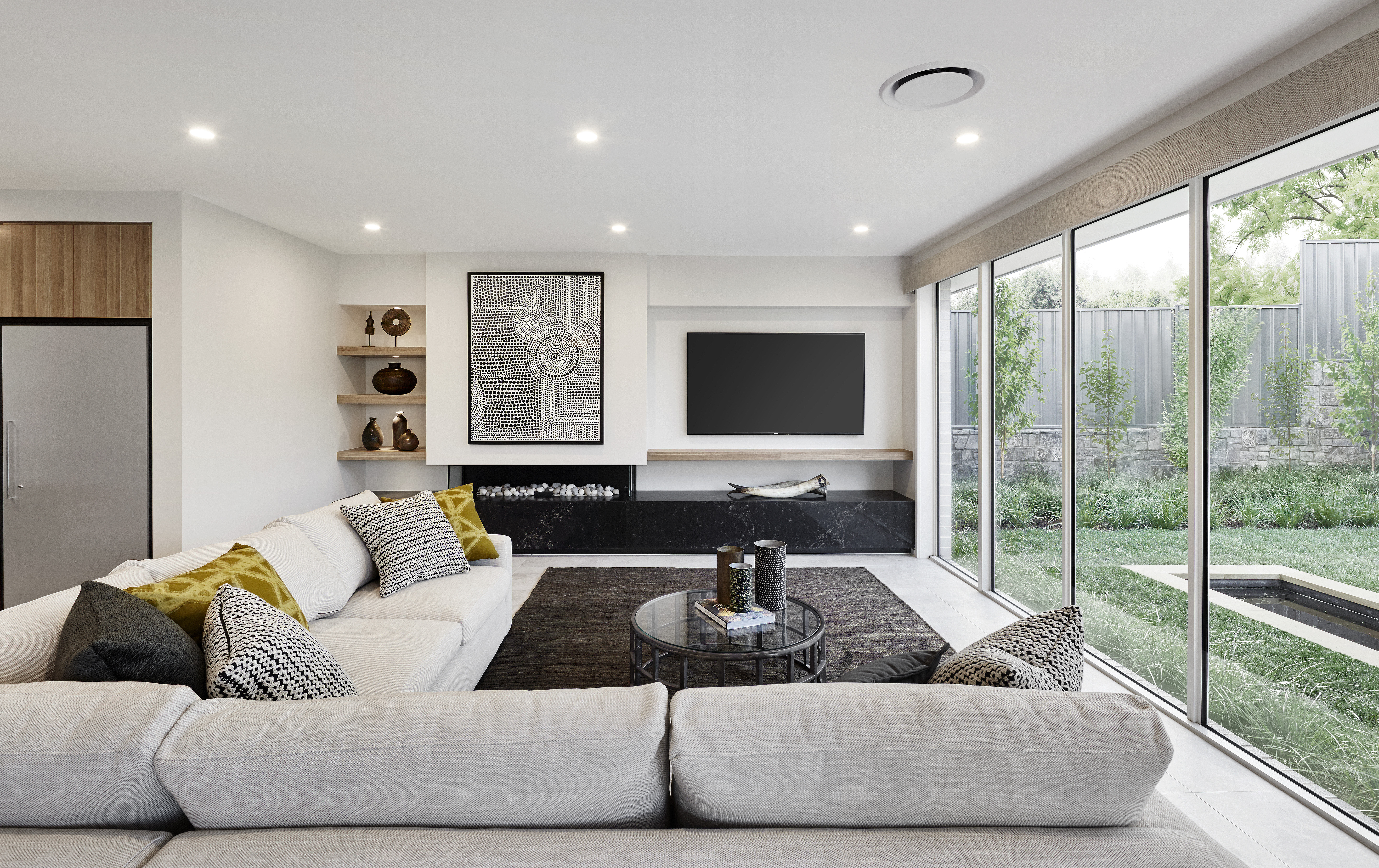
Cushions are one of the easiest and cheapest ways to embrace a colour trend and brighten up a neutral living room. The trick here is variety – don’t be afraid to mix and match different sizes, patterns and textures to create a tactile spot to kick back and relax.
Art
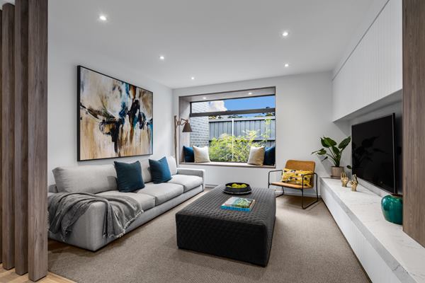
Select a striking artwork as a focal point that will tie everything else in the room together. If you have a gallery wall, look for smaller pieces that will introduce a pop of colour to the rest of your collection.
Accent pieces
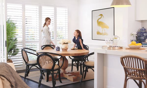
Forget the adage that blue and green should never be seen and introduce Classic Blue into your decor through potted plants and vases. Pretty blue and white patterned ceramics work best in Hamptons-style homes, while funky modular forms will bring modern and minimalist interiors to life.
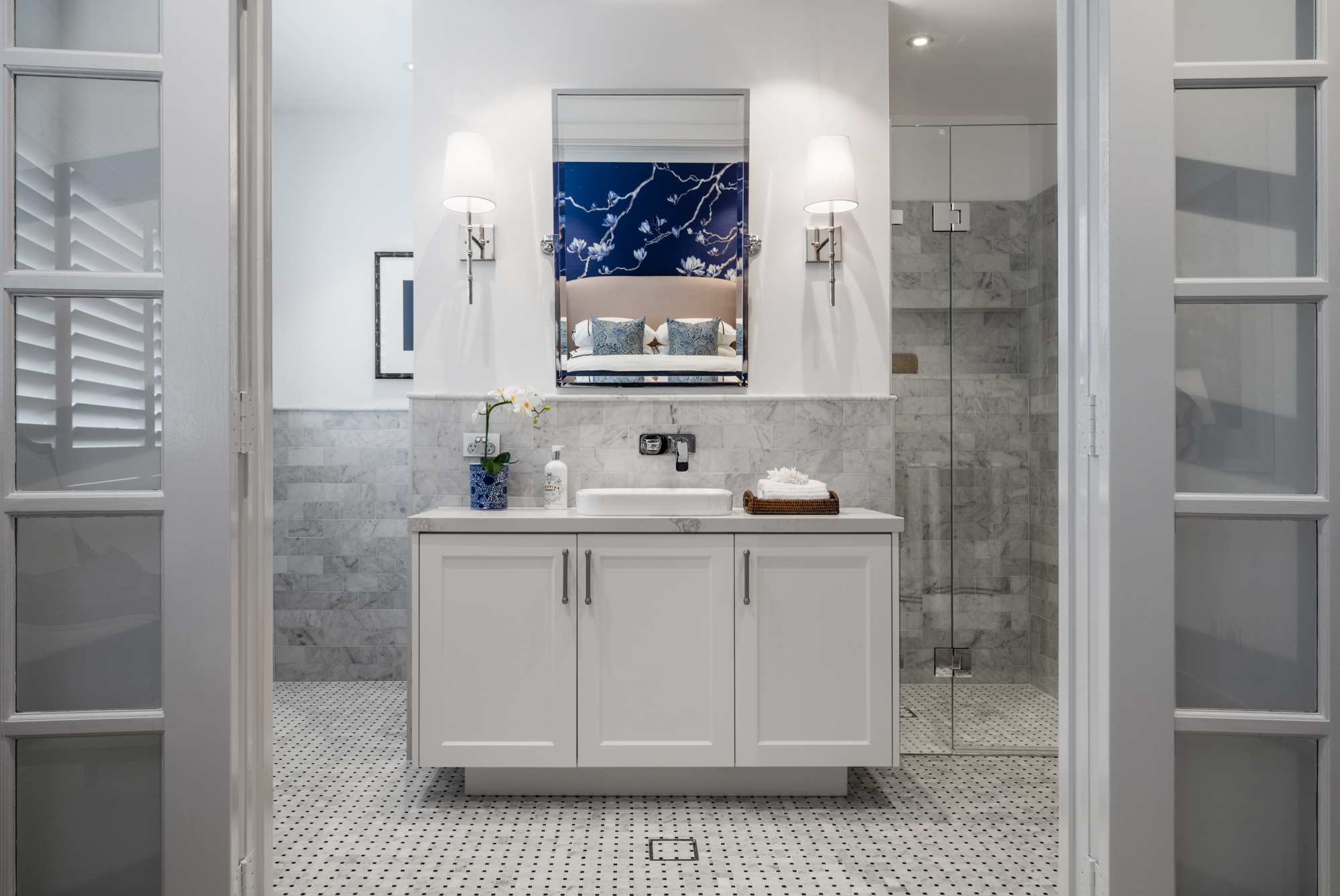
Wallpaper
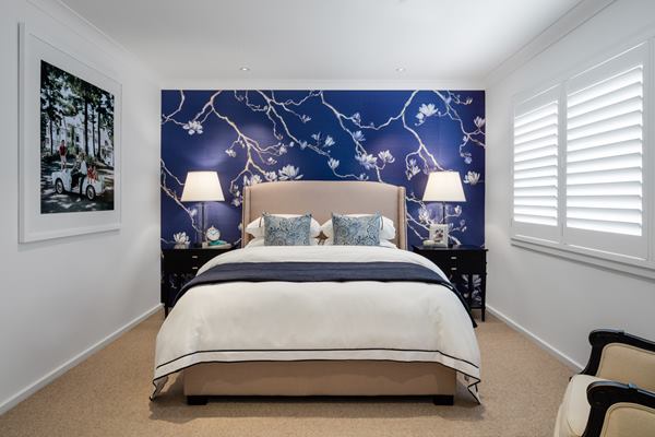
A feature wall in a luxurious patterned wallpaper offers the ultimate ‘wow’ factor.
For more styling inspiration, visit Rawson Homes’ Design Tips & Trends page.